Our Approach
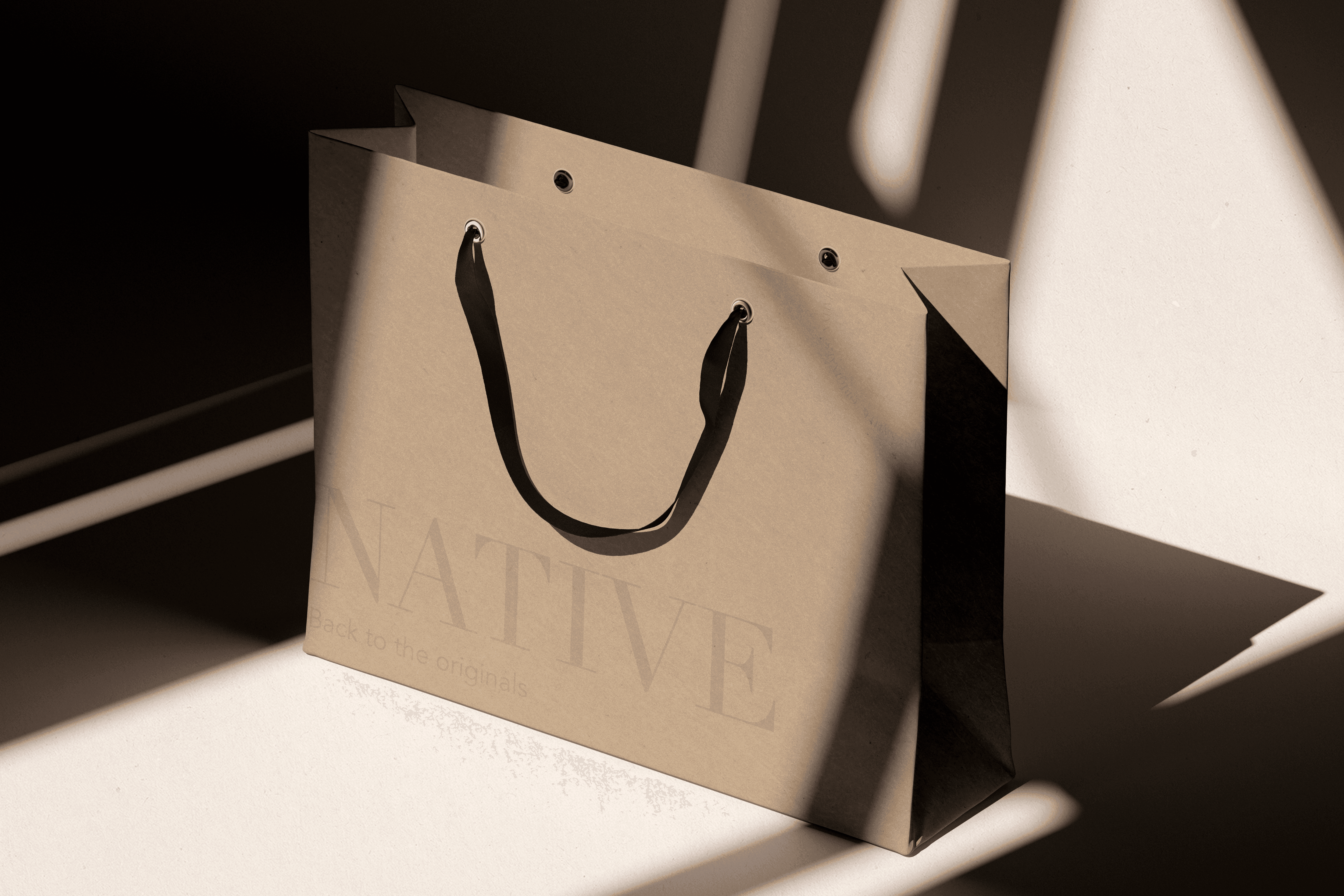
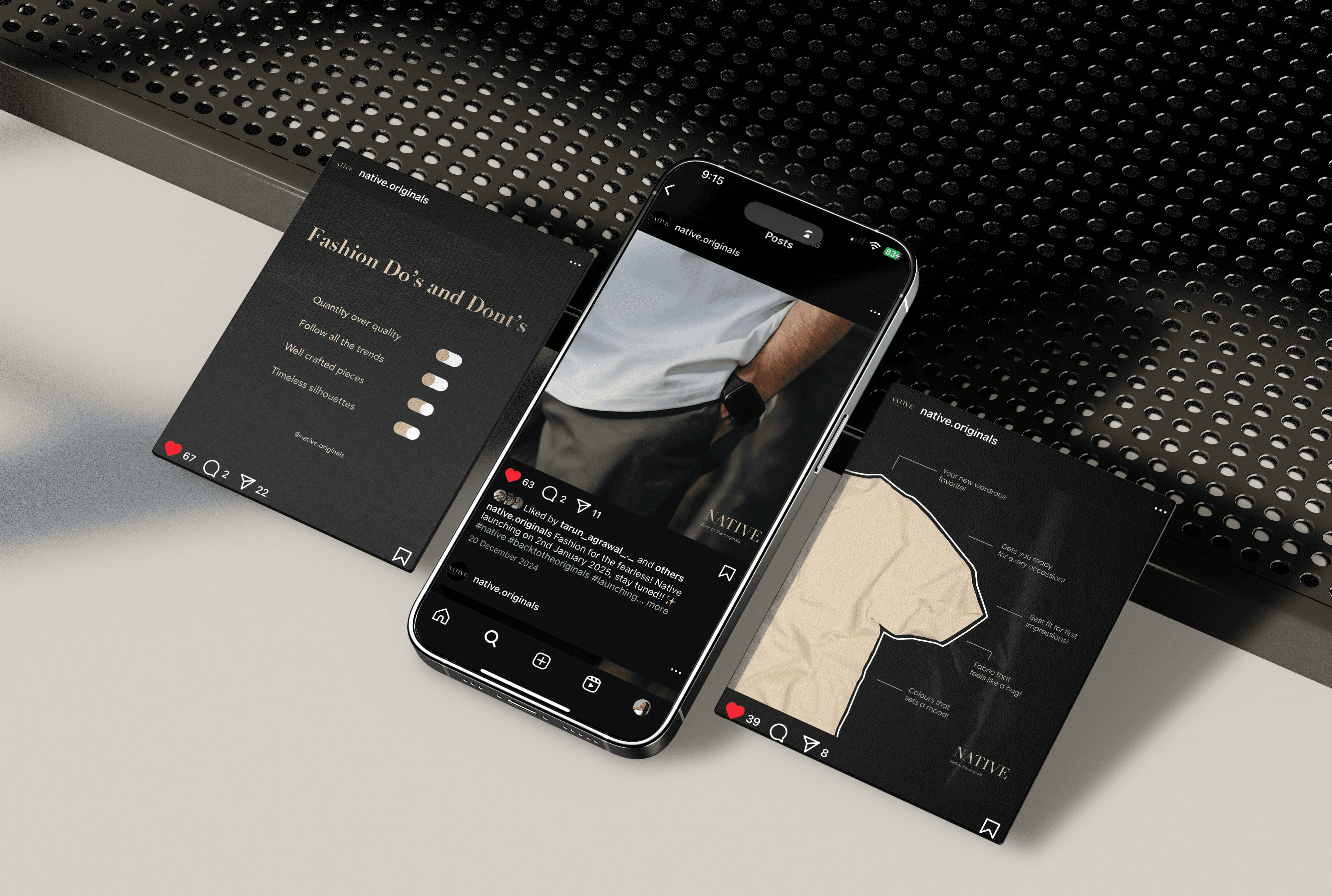
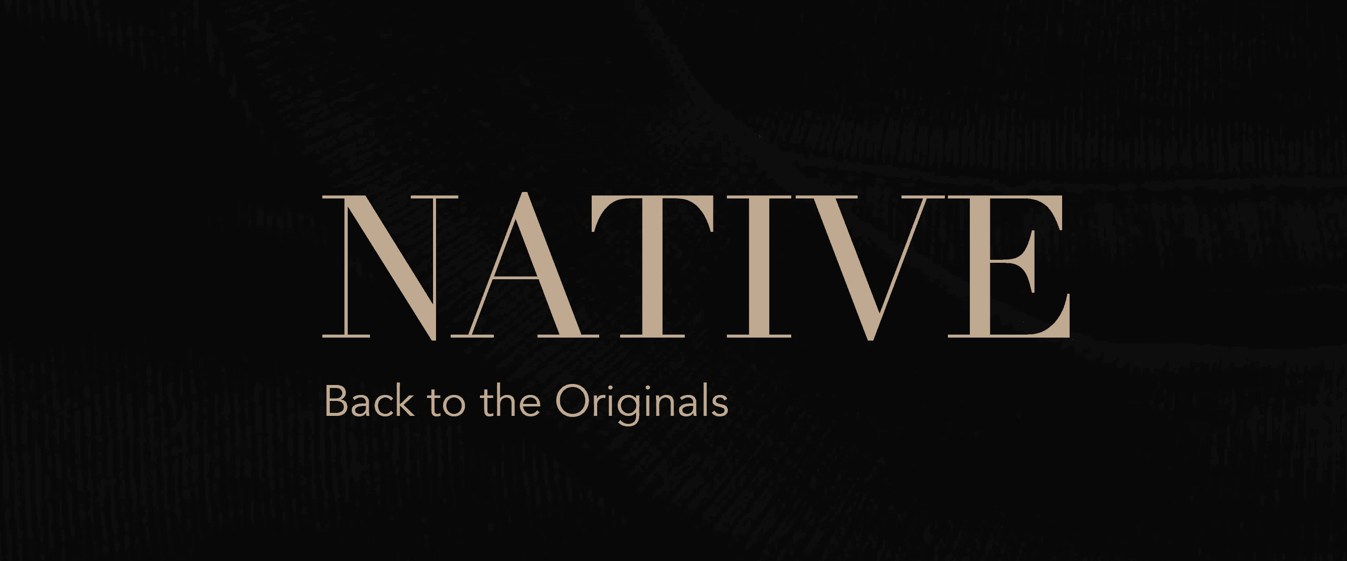
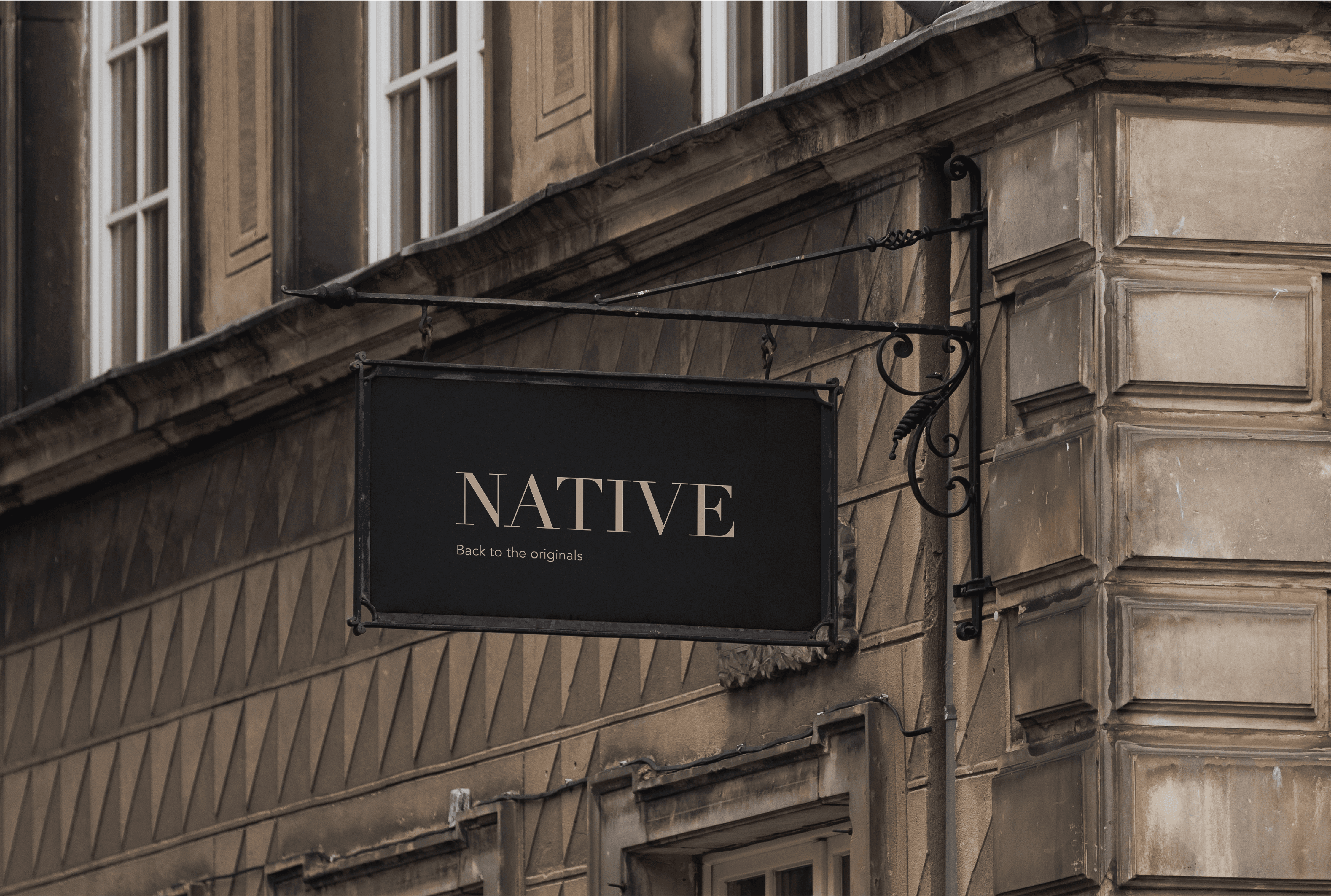
For Native Originals, a men's clothing brand rooted in minimalism, our design approach was centered around clarity, restraint, and timeless style. The logo features clean lines and balanced proportions, embodying quiet confidence. We built a visual identity using a neutral, monochromatic palette, structured typography, and intentional negative space to reflect the brand's understated aesthetic. Packaging was kept tactile and functional, with uncoated textures and single-color prints that echo the simplicity of the garments. The website offers a serene, distraction-free shopping experience with intuitive navigation and large, product-focused visuals. On social media, we maintained a clean, modular system that highlights the product and lifestyle through a refined, cohesive tone. Every touchpoint was designed to mirror Native Originals' essence—elegant minimalism that speaks volumes through subtlety.
Vision
Our vision was to redefine modern menswear through the lens of minimalism—crafting timeless, high-quality essentials that speak through simplicity, not excess. Native Originals envisions a wardrobe built on intention, where every piece is designed to elevate the everyday with subtle confidence, quiet strength, and enduring style. We aim to create a brand that resonates with the contemporary man who values authenticity, form, and function—stripped of trends, grounded in purpose.
Identifying Unique Challenges
Designing for a brand built entirely around minimalism was a challenge of restraint. With no room for decorative elements or loud visuals, every design decision—from typography to whitespace—had to be intentional and precise. The biggest challenge was creating a strong brand presence without relying on bold colors, complex graphics, or trending aesthetics. We had to ensure that the identity remained visually engaging while staying true to the brand’s understated essence. Another challenge was translating the same minimal philosophy across packaging, web, and social media—platforms that often demand louder, more eye-catching visuals. Maintaining brand coherence while making each touchpoint feel distinct and premium required thoughtful iteration and a deep understanding of the brand’s values.
Resolving Complex Problems
We resolved this challenge by focusing on precision, consistency, and clarity—using thoughtful typography, ample negative space, and a tightly curated color palette to create visual interest without noise. Every element was stripped down to its most essential form, ensuring a cohesive brand language that felt confident, premium, and quietly powerful across all touchpoints.Ask ChatGPT
Meeting User Needs
We were successful in meeting user needs by creating a brand experience that felt effortless, refined, and aligned with the lifestyle of the modern minimalist. Through intentional design and consistency across every touchpoint—from logo to packaging to digital—we built a visual identity that made Native Originals instantly recognizable and trustworthy. By letting the product and philosophy lead, we helped Native carve its place as a go-to brand for men who value quality, simplicity, and timeless style—turning minimalism into a bold statement.