Our Approach
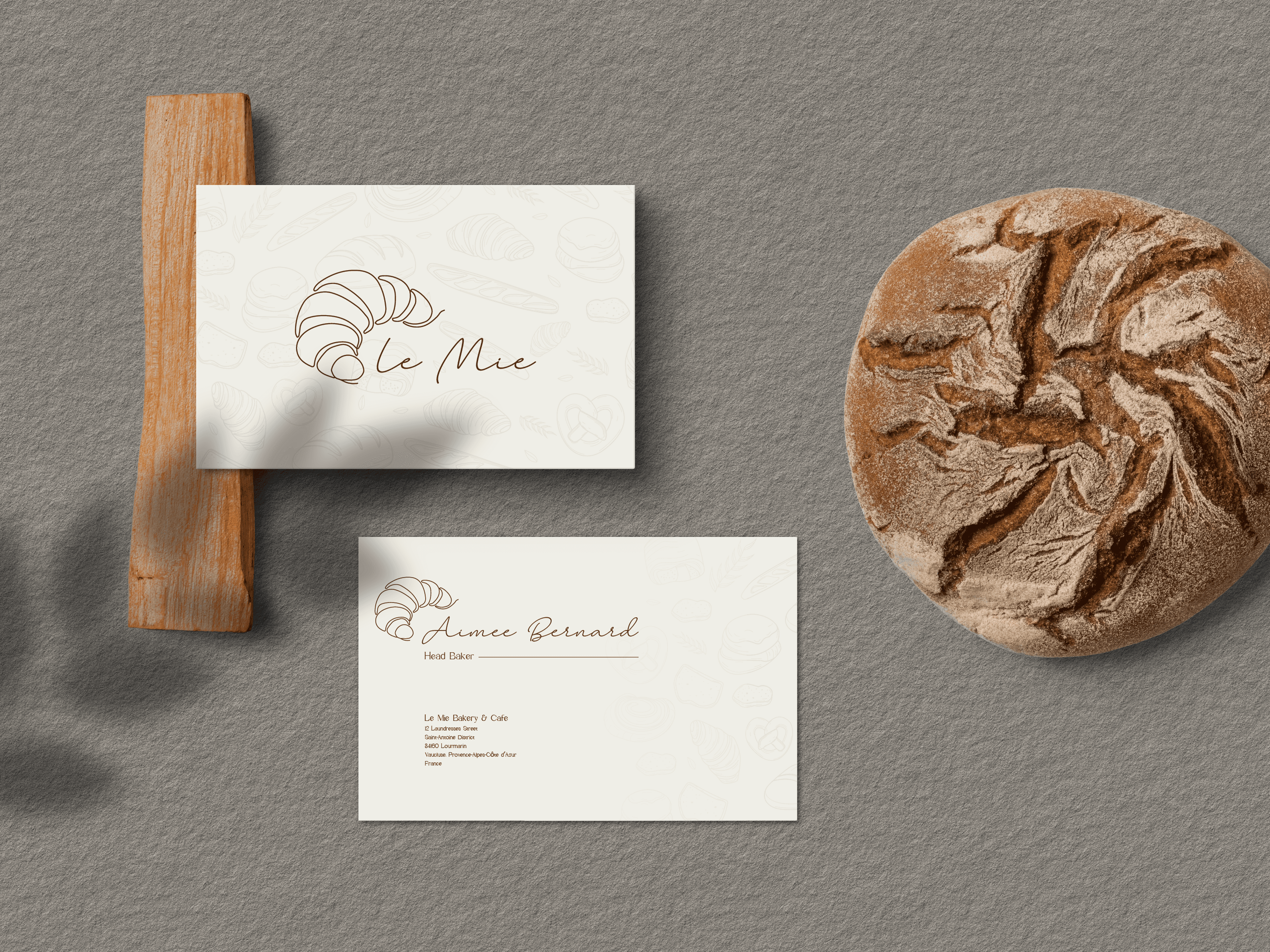
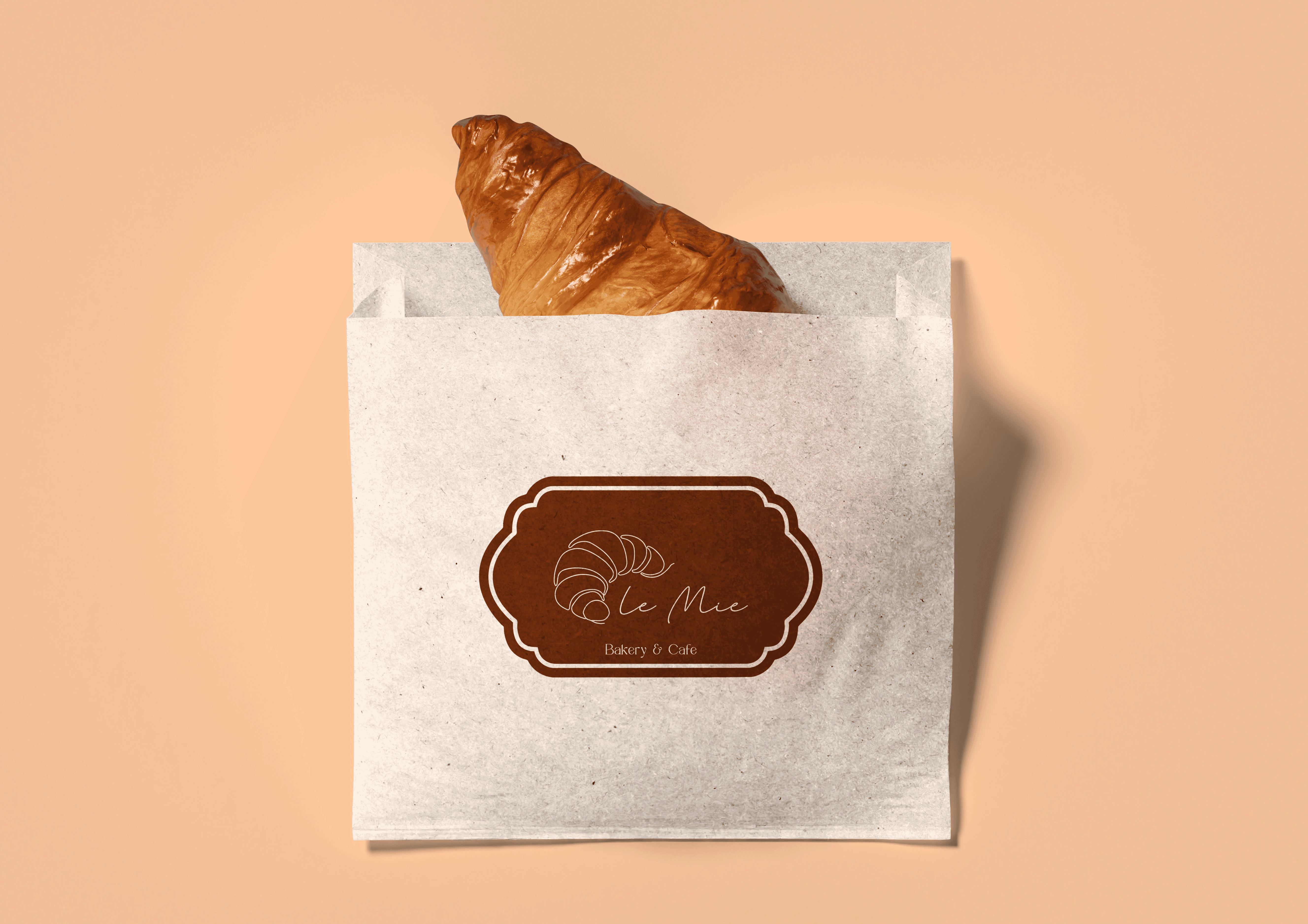
For Le Mie, a French bakery and café rooted in comfort and elegance, our approach was to blend warmth with refinement across all touchpoints. The logo was crafted to feel inviting yet timeless, using soft, flowing letterforms with a subtle artisanal touch—echoing the handmade charm of fresh bakes. The visual identity leaned into creamy neutrals, soft pastels, and elegant serif typography, creating a sense of cozy sophistication. We introduced delicate graphic accents, inspired by vintage patisserie labels and French café culture, to add character without clutter.
Vision
To create a warm and elegant café experience that feels like home—where every detail, from the aroma of fresh bakes to the refined design language, invites people to slow down and savor life’s simple pleasures. Le Mie envisions becoming a beloved neighborhood staple in France, known not just for its artisanal treats, but for the comfort, charm, and timeless beauty it brings to everyday moments.
Identifying Unique Challenges
One of the key challenges was striking the perfect balance between comfort and elegance—ensuring the brand felt warm and approachable without losing its refined, sophisticated edge. We had to avoid overly rustic or overly luxe visuals, instead crafting an identity that sat beautifully in between. Another challenge was capturing the authentic charm of a French café while making the brand visually distinct and memorable in a saturated bakery market.
Resolving The Problems
We resolved these challenges by carefully blending soft, organic design elements with refined typographic choices to reflect both the comfort and elegance at Le Mie’s core. We chose a neutral, pastel-based palette that felt cozy yet elevated, and paired it with classic serif fonts and hand-drawn accents to maintain authenticity and charm.
Meeting User Needs
We met user needs by creating a brand experience that felt both familiar and aspirational—a space where customers could find comfort in the everyday, paired with a touch of elegance that made each visit feel special. The visual identity and social media presence reflected the calm, cozy atmosphere people seek in a café, while still appealing to a design-conscious audience.