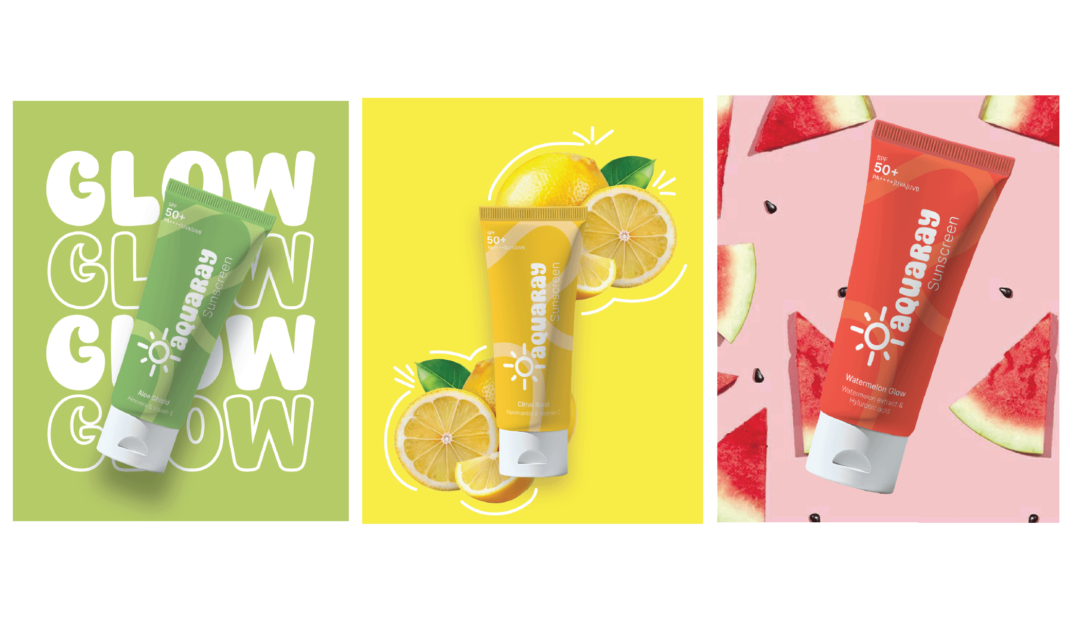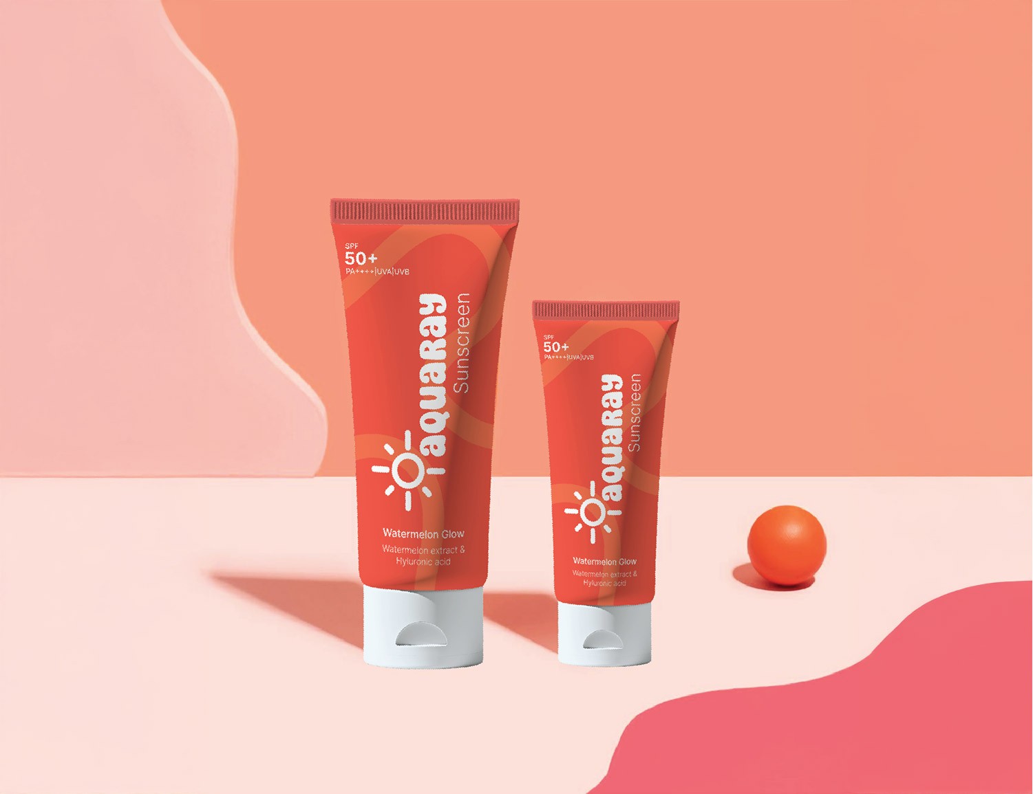
Approach
We wanted Aquaray to feel like the perfect blend of sun protection and ocean freshness. Our design process began by exploring coastal-inspired visuals, clean typography, and a calming yet vibrant colour palette to evoke both trust and summer energy. The logo uses smooth, wave-like forms to convey fluidity and protection, while the packaging balances minimal layouts with strong product highlights, ensuring it communicates effectiveness at first glance.
Challenges
The key challenge was differentiating Aquaray in an already saturated sunscreen market. We needed a design that felt premium yet approachable, and oceanic without feeling overly niche. We also had to ensure ingredient visibility and SPF emphasis without cluttering the clean aesthetic.